
Solo redesign · Experience design
VAP
A redesign of a music app I made earlier. I checked the old version against listener research and rebuilt it around mood-based picks and a home for artist videos. Five screens, shown before and after.
What I set out to fix · Before and after · Research · Brand · Final design
The brief
What I set out to fix
VAP started as an earlier project of mine. For the redesign I treated the old version as the brief: I went back through its data and flows, found where it fell short, and rebuilt it around the listener's mood, with artist videos in the same app. These are the questions listeners kept asking.
What listeners kept asking: "I'm working out, I want something exciting." "I'm in a good mood, should I play something sad?" "I want the artist's video and radio too." "Something for the commute?" "Show my playlists simply." "It's hard to find singers I like."
Before & after
Five screens, before and after
Each change came from a real friction point in the old design. Here is the earlier version next to the redesign, section by section.
Navigation bar
The original hid a circular playback control at the bottom. I replaced it with a clean bottom bar (Home, Search, Streaming, MYMY) and moved playback into the now-larger screen: swipe to change track, long-press for full detail. Notchless phones freed the space to make this the obvious move.

Streaming page
I promoted the high-demand video tab into the navigation, moved the less-used equalizer into the player, and reorganized the video experience by clear categories: Streaming, Radio, and Artist's Channels.

Search page
Ranking and search lived in separate tabs, so new music was hard to find. I merged them into one search space that surfaces rankings and tag recommendations together.

Player
The playback screen went from a cramped pop-up that barely showed the track to a full-screen layout, giving the music, artwork, and controls room to breathe.

Equalizer
I added a 3D equalizer with contextual presets and a custom My EQ, and restyled it to fit the pastel-and-dark brand rather than sitting apart from it.

User Research
The market is shifting from music to video
The redesign started from market data. To ground it, I studied how the MZ generation (the Korean term for millennials and Gen Z together) listens and watches, benchmarked Korea's leading services, and traced the global move from downloads to streaming. Two market-share numbers stood out, and global industry data shows downloads falling from 2012 onward as streaming took over.
Market share, music and video
Among MZ-generation users, Melon leads music while Netflix dominates video, the two poles the redesign had to bridge.

Korea's music services, up close
I looked at how Melon, YouTube Music, and Genie compete: Melon's dominance slipping on pricing, YouTube Music riding bundled Premium video, and Genie leaning on telecom tie-ins. The common thread is that music platforms are all racing to add video.

From music to video
The clearest signal was directional: habits are shifting from music toward video, driven by changes in distribution and the rising importance of cost-effective, video-rich platforms. Global consumption data shows downloads falling and streaming climbing from 2012 onward.


Korea and the US, one direction
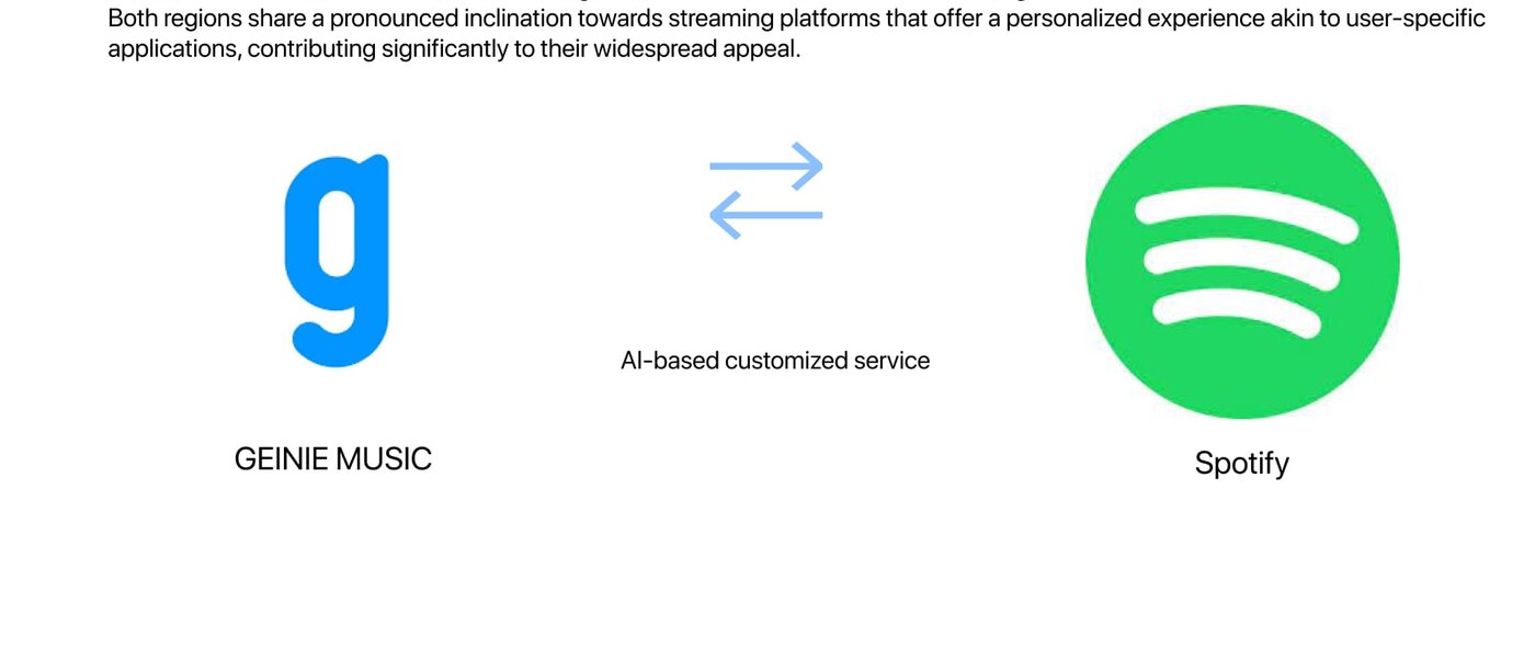
Both markets lean the same way: toward streaming platforms that feel personal and AI-tailored, from Genie Music to Spotify. That shared pull toward a personalized, user-specific experience set the target for VAP.
Concept
Concept: three design keywords
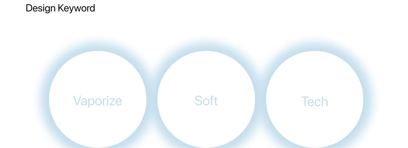
The name comes from "vaporize". Three keywords set the look of every screen: vaporize, light and retro-futuristic; soft, calm pastels and gentle motion; and tech, AI that picks music and video for each listener.
Personas
Two personas
Persona work fine-tuned the target audience and surfaced their specific needs. Two people captured the split the redesign had to serve: Steve, who cannot live without music and wants suggestions that match his mood, and Emma, an idol superfan who wants every artist video in one organized place.

Brand & foundation
A new logo and brand
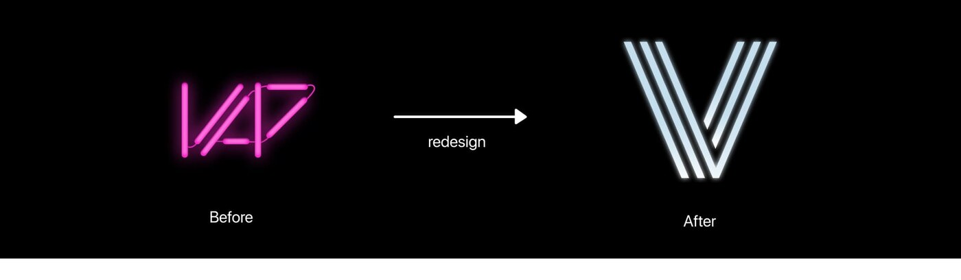
With the concept set, I rebuilt the brand system from the logo out. The old bold-red mark did not fit a calm, technological feel, so I redrew the 'V' from 'vaporize' as a sleek, neon-striped mark, then defined its variations, color, type, iconography, and a cleaner information architecture.
Logo, before and after
From a heavy red wordmark to a light neon 'V', a mark that reads as vapor: delicate, soft, and technical.
Logo variations and color
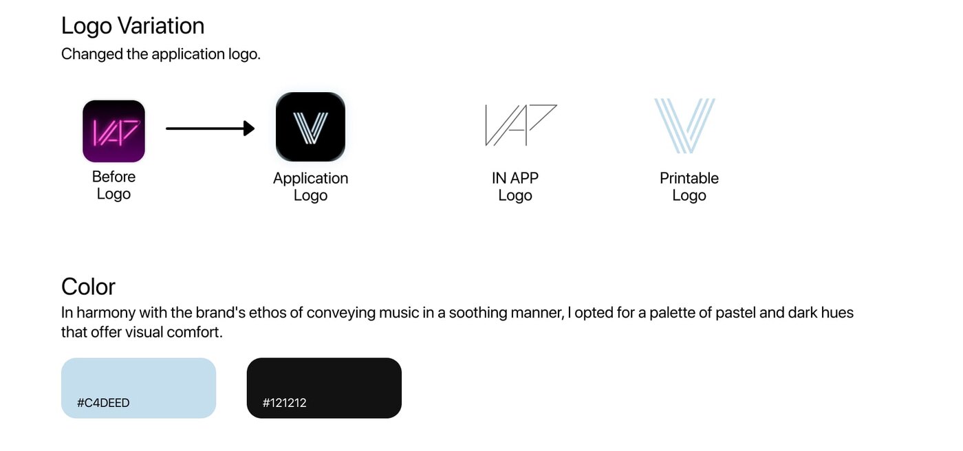
One mark, four uses: before, application icon, in-app, and printable. The palette pairs a soft pastel blue with near-black to convey music in a soothing, visually comfortable way.
Icons and type
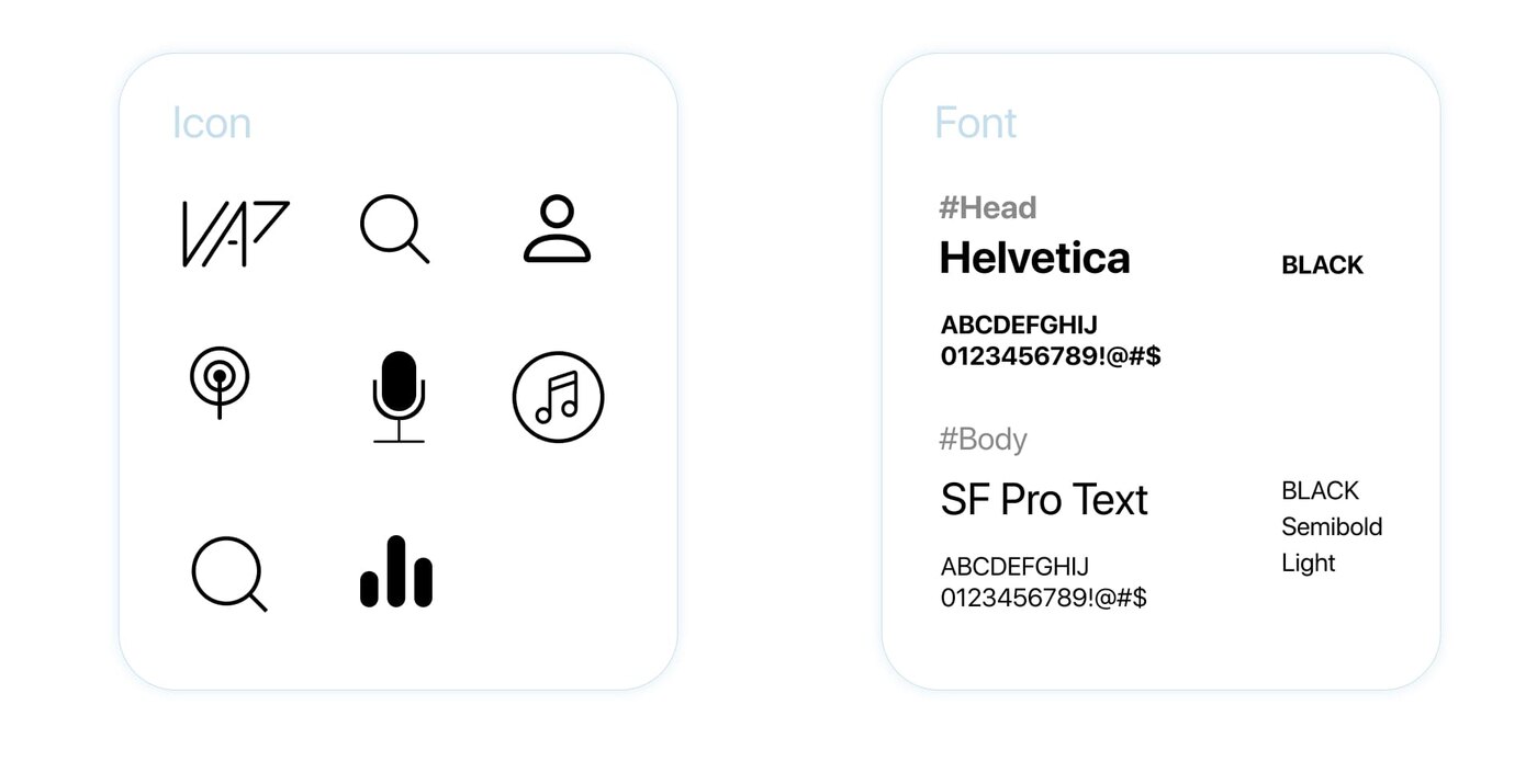
A custom icon set for the tabs and player, with Helvetica for headings and SF Pro for body: clean, legible, and quietly modern.
Information architecture
An IA pass reorganized everything into four clear tabs: Home, Search, Streaming, and MYMY, so mood-based music and artist video each had an obvious home.

The final design
The new VAP
The finished redesign across its four tabs: a mood-based home, a merged search, an artist-and-video streaming hub, and a reorganized library. Click any screen to see it larger.


Reflection
What I learned, and what I'd test next
The redesign started from the questions listeners kept asking, like music for a mood and the artist's video in the same app. That became the mood-based tabs and the artist video home. The full-screen player and equalizer came from fixing the old design. Next I would test with real listeners whether mood-based picks work better than browsing by genre.
Next project
Graphic Design · One-year internship at J.Cat Beauty