M.A. thesis · Interactive installation
SomaSpace
An installation I designed and built for my M.A. thesis. A webcam tracks your body, and the wall answers with soft, changing visuals and a low sound. There are no buttons and no instructions. Move quickly and the visuals get busier; slow down and they calm down with you.
Final demo, the installation running live.Watch on YouTube: youtu.be/31B_y4Q9nCs
Earlier prototype, motion driving the particle field.Watch on YouTube: youtu.be/8ATLH7qLYsY
Why I made this
A calming tool that gives no instructions
Like a lot of people, I spend most of my day on a screen, and I noticed how rarely I actually feel present in my own body. Notifications, deadlines, and endless feeds pull attention outward until tension shows up as shallow breath or tight shoulders, usually unnoticed until it becomes fatigue. Most tools meant to help ask the mind to work harder: follow these steps, breathe on cue, track your progress. I wanted to try the opposite. SomaSpace began from one question: what if grounding did not need instructions at all, and could instead emerge from the body itself, through movement, perception, and a space that quietly responds? That question became my thesis.
Body movement, hand distance, and an open or closed palm.
Fluid, particle, and node visuals paired with responsive sound.
Literature, precedents, qualitative feedback, and prototype iteration.
How it works
Two gestures, three visuals
There are no buttons and no menus. The whole experience is driven by two body gestures: the distance between the hands, and opening or closing the left palm. The first shapes the visual and the sound at the same time. The second switches between the three graphics.
Interaction 1 · Hand distance
Hand distance is the main control, and it changes the visuals and the sound together. Bring your hands closer and the visuals gather into a smoother, slower shape while the sound gets quieter. Spread them wider and the visuals loosen and move faster while the sound gets louder. Both change smoothly between a set minimum and maximum, so nothing jumps.
Fluid, closer and wider.


Particle, closer and wider.


Interaction 2 · Open and close the palm
Opening your left hand switches to the next of the three visuals, and repeating it cycles through all three. MediaPipe reads the hand as simply open or closed, so it works like a button. It is kept separate from the hand-distance control so the two never get mixed up.
The three visuals
I built three visuals, and each one responds to movement in its own way.

A continuous stream that grows expressive with fast movement and softens as you slow. The baseline perceptual anchor.

Renders the body as a field of particles and leaves a stain-like trace, so continuity of movement becomes visible.

A loose, cloud-like field that disperses and reconvenes around subtle motion. Chosen as the dominant direction after qualitative feedback.
Movement traces (depth map)
On top of hand distance, the depth map adds one more behavior of its own. When the body is still it renders a clean form, and when it moves it keeps a fading trace of the gesture, so continuity of movement becomes visible over time.


See how the camera, tracking and sound worktechnical detail
Technology: the pipeline
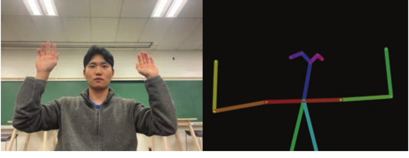
Four parts run in order: webcams, MediaPipe, TouchDesigner and a projector. Together they turn body movement into visuals on the wall in real time.
Captures live frames of the upper body and hands at chest height. A sensor for shape and motion only, with no identity recognition.
Detects pose and hand landmarks, outputting 3D keypoints for shoulders, elbows, wrists, and finger joints.
Smooths jitter, measures velocity, hand distance, and stillness, then maps those to visual parameters.
Renders the scene at room scale on a matte wall, with luminance tuned for low light so visuals feel soft.
System mechanism
The system runs on a simple loop. The webcam receives the body, MediaPipe generates the motion information, TouchDesigner reads it, and the scene renders back on the wall in real time. From there, everything the user does comes down to just two gestures.


Sound, in more detail
The tone itself is a low-frequency ground sound between 80 and 100 Hz, a range that can be felt physically and supports relaxed, sustained attention. It is not music or instruction but a quiet layer that mirrors breath and reinforces the link between body and visual, present enough to notice and easy to ignore.
Design process
How I got there
The rest of this page is the process, in the four phases of the Double Diamond: two rounds of opening up and narrowing down, first on the problem, then on the solution.
Explore widely: research, literature, and precedents on body-based grounding.
Narrow to a clear problem and the person it serves.
Prototype and test the visuals, sound, and mechanism.
Refine, install, exhibit, and reflect.
Understanding body-based grounding
The Discover phase asked a single question: what if the path to grounding started not with instruction, but with sensory experience? Most wellness tools begin with the mind, explaining how to relax, and add another layer of demand at the exact moment attention is already tired. SomaSpace instead treats the body as the interface, where small changes in posture, pacing, and pause say something about how a person is feeling.
Literature review
Four studies anchored the concept, each answering one core question about grounding, awareness, and nonverbal interaction.
Grounding is an embodied process, visible through posture, weight, and rhythm, and can be read without words. (Engelhard et al., 2021)
Awareness is a lived, ongoing process shaped by environment, so systems should support noticing rather than directing. (Kjolstad et al., 2022)
Attending to internal sensation reduces cortical load and lets awareness arise without language. (Farb et al., 2023)
Gentle, non-continuous visual feedback heightens awareness of action and guides attention without instruction. (Yu et al., 2024)
Case studies
Eight precedents, from art installations to everyday objects, showed a common pattern: grounding is most effective when a system responds gently to the body and invites slow, sensory attention.
Mirror Ritual responds gently and never grades the person in front of it.
Responsive light synchronizes a group's perception and supports calm.
Rain Room reacts to a person simply being there; nobody has to do anything right.
Balanced frequency and soft rhythm ground people without cognitive tasks.
Predictable, repeated motion releases restlessness and restores focus.
Texture invites slow, hands-on attention that reduces tension.
Steady tempo and tactile counting deepen presence over time.
Shifting attention from thought to sensing anchors a person in the moment.
What the Discover phase decided
- The body is the start. Grounding begins when people sense their own posture, movement, and rhythm, without needing words.
- Quiet attention. People settle when cognitive load is low; simple sensory cues beat verbal steps.
- Gentle responsiveness. When the environment mirrors movement softly, people feel grounded without pressure.
Framing the problem and the person
Modern life is filled with constant visual and cognitive stimulation, and most tools meant to help require guidance, steps, or progress to measure, adding effort at the exact moment users have little attention left. The problem is not a lack of tools but the high interactional load built into them. There is very little between tools that over-direct and tools that ignore the body entirely, so SomaSpace sets out to be a listening tool: the body leads and the environment follows.
Project statement
To create a peaceful digital space that helps people feel more grounded and present, users interact with a screen that changes in real time based on how much they move. As they slow down and become still, the visuals gently respond, helping them feel calmer, more relaxed, and more connected to the moment.
Target audience and expected effects
The audience emerged from the research: people carrying constant stimulation who need simple, sensory relief. The expected effect is a sense of relief that comes from quiet, perceptual interaction rather than direction, so they can reset attention and return to their body without feeling judged.
People who move fast through the day and want short sensory pauses that need little instruction.
Students, designers, and knowledge workers seeking brief resets between tasks.
People in galleries or on campus who welcome a quiet moment they can enter and leave easily.
Persona

- Age
- 27
- Work
- Visual content designer
- Location
- Los Angeles, CA
- Traits
- Reflective, empathetic, occasionally anxious
- Tech
- High comfort
"I don't want the app telling me how to calm down. I just want to feel connected again."
Needs
- A brief way to reset attention between tasks
- A sensory moment with no steps or mental effort
- Space to simply notice, without being evaluated
Behaviors
- Juggles apps, tabs, and client messages
- Takes short breaks but usually scrolls or checks email
- Loves ambient light, color, and texture, and visits gallery installations
Frustrations
- Overloaded by guided wellness apps
- Finds most digital tools too task-oriented
- Little time or attention for anything demanding
User journey map
Mapping Jennifer's journey traced her arc across six moments, from curiosity and hesitation, into playful exploration, and on to slowing down, a grounding moment, and reflection, with her emotions rising as the visuals began to mirror her.

Data collection
Feedback on the early prototypes covered three things: the visuals, the sound, and how people described the experience afterward. The thesis records this feedback qualitatively, without a participant count, so there are no percentages here.
Visuals. Qualitative feedback favored graphics that expand and contract at a calm, steady tempo, with long fades, smooth transitions, and low-contrast shifts. Cool sea green and muted blue supported stillness, while soft golds and purples offered warmth and renewal.
Sounds. The sound direction prioritized natural, environmental qualities described as steadier and less demanding than spoken guidance. That led to a low-frequency layer between 80 and 100 Hz that acts as a felt anchor.
Qualitative themes. Feedback and design reflections converged on immersion, connection, awareness, trust, and release. These themes informed the emphasis on a calm visual pace, visible response, and open-ended exploration.
Storyboard
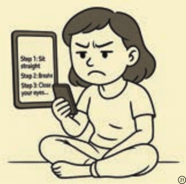
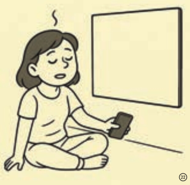
The target experience, from a rigid app to a field that answers her movement and settles as she settles.
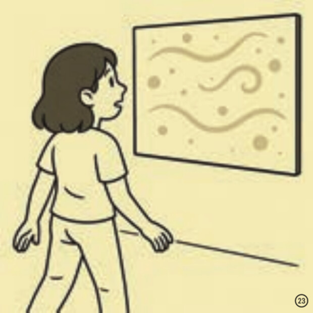
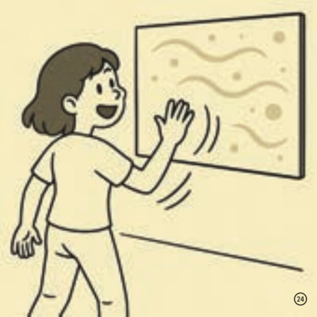
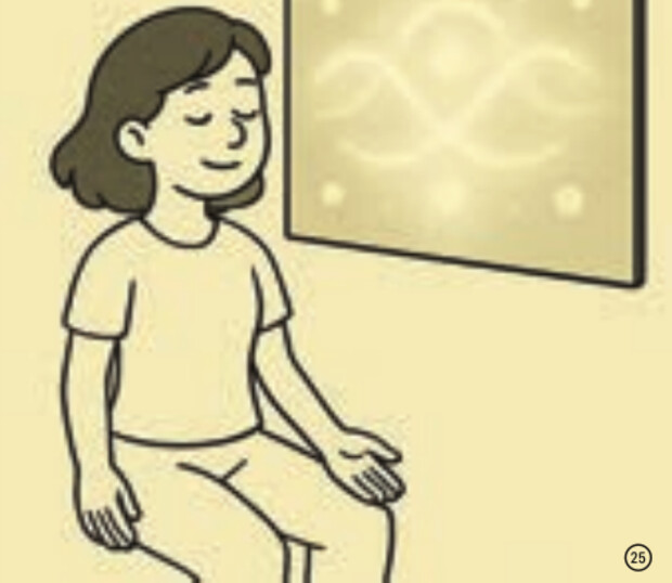
What the Define phase decided
- Minimize instruction. People are overstimulated, so keep the interaction simple and prioritize perception over steps.
- Let users set the pace. Brief sensory moments that let people reconnect without being told what to do.
- Body leads, space follows. People settle when sensory cues mirror their presence softly and naturally.
Building the system
The Develop phase turned the research into a working system. The gestures and visuals are shown at the top of this page; this part covers the look, the color choice, and testing.
Inspiration
Inspiration connected the psychology to a visual language of texture, motion, light, and feeling: opacity gradients for depth, low spatial frequency so large soft forms fill the field, and temporal smoothness so long fades replace abrupt cuts. References like diffused glass, cloud chambers, underwater light, and long-exposure smoke, where motion reads as continuity rather than displacement, guided the look. Every iteration was checked against a small emotional vocabulary.
Long fades and slight motion blur replace abrupt transitions, so nothing competes for attention.
Motion reads as a continuous stream, drawn from diffused glass, cloud chambers, and smoke.
Low spatial frequency lets large, soft forms fill the field while small details stay quiet.
Fluid: the one mode with two color families
The fluid graphic is the only visual built in two tone families. Research split almost evenly between warm and cool for stress reduction, so instead of choosing one, I made both and let each person settle on whichever soothes them. Cool turquoise, sea green, and muted blue support stillness and inward attention. Warm amethyst, soft gold, and amber offer gentle activation and re-emergence.

Usability testing
Two build-and-test iterations shaped the final form.
Goal: test approachability. Easy to access, but outside movement pulled focus. Insight: grounding needs a contained space.
Goal: test immersion. The enclosure increased immersion, but it also felt uncozy and pressured people to be calm. Insight: let movement feel natural while still grounding.
Making the trace legible. Testing showed that people wanted to see a visible trace of their movement. The depth map was therefore separated from the fluid visual, preserving both the reflective trace and the ambient visual field.
Across informal feedback moments, the experience was often described as intuitive and immersive. Those observations informed the final balance of gentle motion, responsive feedback, and open exploration. The project does not claim a measured wellbeing outcome.
What the Develop phase decided
- Visual language. Soft, fluid, patient visuals with gradients, low detail, and slow rhythm best support grounding.
- Color and tone. Two families, cool and warm, offered as options that keep harmony across the modes.
- Interaction logic. Simple body cues, distance, pacing, and stillness, change what happens without any instruction.
- Lightweight setup. Webcam, motion tracking, and real-time rendering give enough responsiveness for immersion.
From still meditation to free movement
At the technical review on October 16th, SomaSpace was presented as a functioning grounding environment, but the visuals left people unsure whether to move or stay still. The original concept was built around meditation and stillness. Based on committee feedback, I added the low-frequency background sound and reframed the whole experience: users now move freely and find their own grounding moments through interaction, rather than holding still to achieve calm. Movement became the core input.
Final prototype and installation
A beam projector displayed the visuals on the wall while two webcams captured the interaction: one tracked overall body movement and the other read depth for smoother tracing and a clearer angle of detection. A chair marked the ideal detection distance, and a simple guide on the desk explained the two key gestures, so the experience stayed intuitive and self-explanatory without any verbal instruction.

Exhibition
SomaSpace was presented as a two-hour public showcase. Visitors could step into the field and move freely while it responded in real time. The presentation provided an opportunity to observe self-guided exploration in a public setting.


Future development
Distinguish several bodies in one frame, give each a visual signature, and build shared visuals that respond to group synchrony.
From a portable kit for classrooms and therapy spaces up to full multi-wall or LED installations.
Limitations
Tracking and projection depend on a dimly lit, controlled space; bright or uneven rooms reduce clarity.
Detection relies on the webcam reading contrast, so it can drop or misread when lighting is inconsistent.
Summary of the Deliver phase
The review reframed the project from enforced stillness to movement-led grounding, and the refinement made movement the core input. The final presentation offered a public setting for observing self-guided exploration. The two-camera setup supported clearer tracking, while the gesture guide kept interaction legible without verbal instruction.
Sources
Research and credits
SomaSpace is a thesis-led design exploration, not a clinical outcome study. Literature, precedent review, prototype feedback, and presentation observations informed the work. The thesis does not document a participant count or a formal study protocol, so the evidence on this page is presented qualitatively.
Abby Bradecich, Psy.D., informed the attention to slow movement, biofeedback, and a comfortable, safe environment.
The persona portrait and six storyboard frames were generated with ChatGPT, GPT-4, OpenAI.
Reflection
What I learned, and what I'd test next
I left out buttons and steps on purpose, so I had to check that people still knew what to do. At the technical review, the first version was built around holding still, and people were unsure whether to move or stay still. I rebuilt it around free movement and added a printed guide to the two gestures. Next I would test whether the calming effect lasts beyond one session, and test with people who have limited arm movement, since the system assumes you can move your arms freely.
Next project
Hot Chocolate · AR chocolate keyboard for Snap Spectacles