Solo project · UX case study
KindBite
An app for giving surplus food to neighbors who need it. I started out designing for sharing home-cooked meals. My survey changed that: people were open to giving and receiving, but only if it felt safe and private. So the app became about ingredients, contact-free pickup, and a trust score.
Full product walkthrough.Watch on YouTube: youtu.be/pyO6soLrj0UOpen the Figma prototype
Outcome
What the research changed
I ran a survey and interviews to test whether peer-to-peer food sharing was actually wanted, or just a nice idea. The results were decisive enough to reshape the core of the app: they ended my original "share your home-cooked meals" concept, and they put trust at the center of the app. Pride was not the barrier I expected. Receiving shared food did not hurt it. Trust and safety were what held people back.
The Product
The four main screens
Home
One place for shared food nearby, the global donation feature, and community events, so giving money and giving food live side by side.

Explore
A map of what is available near you, with distance and pickup window on every listing, and dietary filters for Halal, vegan, and allergen needs so nobody has to ask an awkward question.

Post
Sharing is as simple as posting a photo, adding a category and an available-until date, and choosing a handoff. The pickup option lets a giver skip scheduling and the awkward handoff entirely.

Profile and the KindScore
KindScore is the trust system the research demanded. Everyone starts at 600 and needs 700 to begin sharing food. Showing up and sharing safely raises it; no-shows and expired items lower it; below 300 carries a penalty. It gives strangers a reason to trust each other without forcing anyone to reveal who they are.

The Problem
Food need and food waste on the same street
Some people cannot reliably afford to eat: international students who are not allowed to work, people living alone without a safety net. At the same time, their neighbors are throwing away food that is still good. The two sides are often on the same street and never meet. Existing options do not close that gap: second-hand marketplaces are not active for food, and food banks ask for proof and paperwork that many people do not have.

Where existing apps stop
I studied three products already in this space. Olio handles neighbor-to-neighbor surplus but leaves listing slow and pickup socially exposed. MealConnect solves food rescue at business scale, not for individuals. Share the Meal makes donating money effortless but has no local, physical exchange. Each does one part well, and none covers a hungry student at 9pm two blocks away.


User Research
What people actually told me
I ran a survey plus open-ended questions covering food access, past reliance on help, willingness to give and receive, motivations, and blockers. I analyzed the responses across three dashboards.
Food access

Openness to sharing

What stops people

What I did with it
Open answers were blunt and useful: people wanted verified donors and review-based credibility, anonymous profiles and contact-free pickup, in-app chat and public meeting spots, and visible proof of impact. Several also said they would share ingredients even when they could not share cooked food.

Home-cooked meals raise food-safety and liability problems, and users flagged it. The product shifted to packaged goods and ingredients.
Contact-free pickup, anonymous chat, reviews, and a visible score, instead of a simple listings feed.
Halal, vegan, and allergen filters so sharing is intentional rather than a gamble.
Meals shared and waste avoided are surfaced, because seeing the result is what keeps people giving.
Design Foundation
Designing for Charlie
Charlie is 24, an international graduate student living alone in a rented room, working part-time and stretching ingredients across days. He is independent and introverted, and he will not ask for help face to face. His line became the design brief: "I don't want to ask for help directly, but if there's a quiet way to give and receive, I'd be all in."

Journey map
Mapping Charlie's arc from hunger to ongoing use exposed exactly where the design has to carry him: hesitation at sign-up about handing over personal details, and anxiety right before the pickup. Those two moments are where contact-free options and the trust score do the most work.


Design Process
From flow to screens
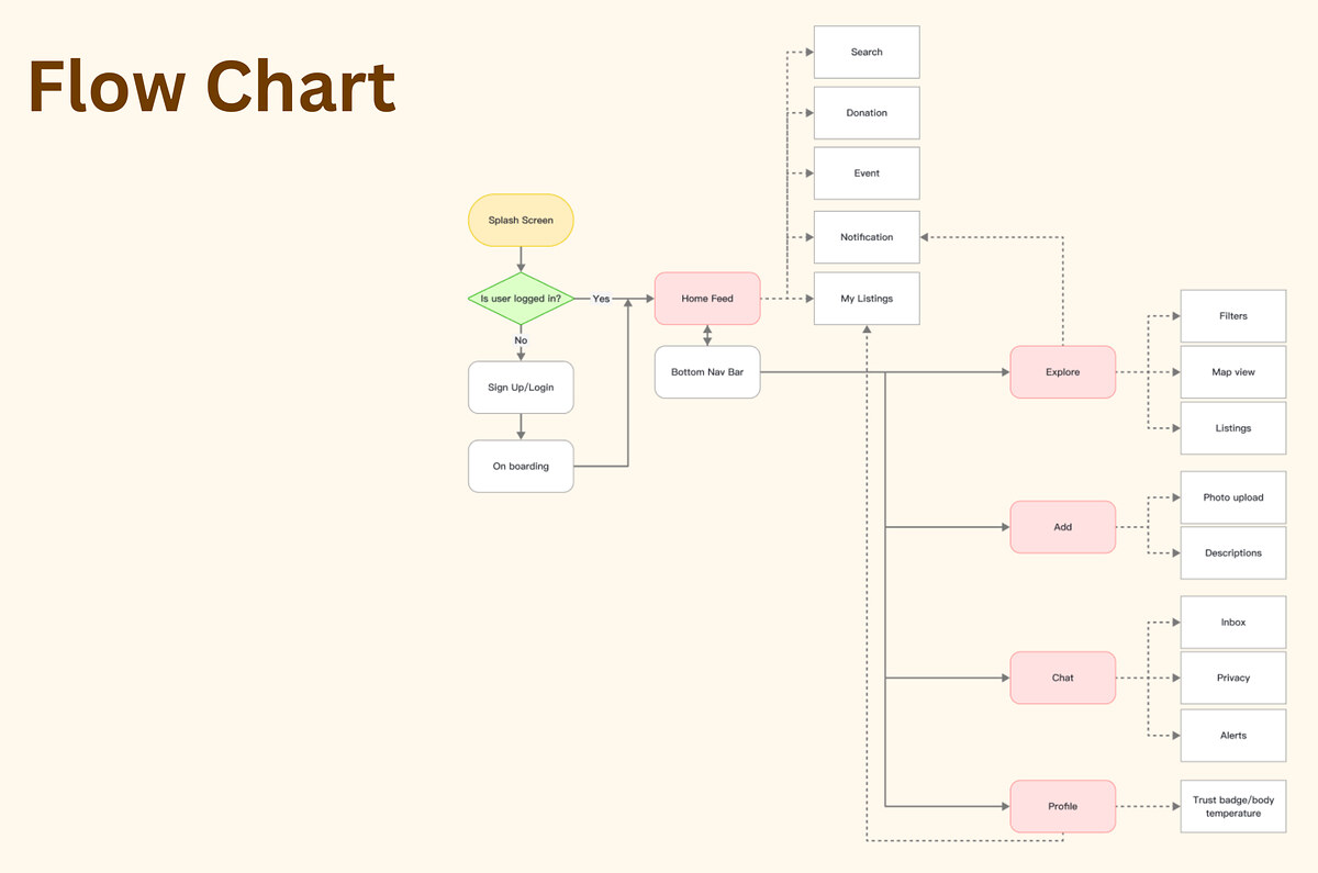
I mapped the full flow first, then worked from sketches through a three-column grid into low and high resolution wireframes, so the structure was settled before any visual polish.

Evaluation
Heuristic evaluation
I ran the finished flows against a heuristic checklist to catch the usual failures before they reached a user: system status, error prevention, recognition over recall, and consistency across the tabs.

Reflection
What I learned, and what I'd test next
I assumed pride would be the barrier, and I was wrong. The survey showed that safety and trust were, and that home-cooked food raised food-safety problems, so I rebuilt the app around ingredients, anonymity, and a visible trust score. Next I would test whether the KindScore rules feel fair to new users, since needing 700 points to start sharing could lock out the people who need the app most.
Next project
VAP · Redesign of my own music app